


We are back and ready to get our Brand Style Guide on, baby!
In last week’s post How To Create A Brand Strategy For Your Blog, we dug deep into our brand strategy and built out an identity that truly aligns with your goals and mission. We know who we are helping and how.
On the last leg of our journey to creating a brand for our blog that is aligned with our mission and speaks to our target audience, we are going to cover everything from designing logos to creating colour palettes and choosing our fonts.
Creating Your Brand Visuals
Brand Logos
Probably the most important visual element of your Brand Style Guide, your logo sits at the forefront of your brand.
I’m going to be honest though, I honestly think that designing your logo is the hardest part of this entire DIY brand creation process.
For this reason, I’m going to give you a few options that you can opt for here depending on your level of skill when it comes to design, your budget, or honestly just your patience level.
Canva Logo Templates
Canva is an amazing design software option for anyone from beginners to advanced designers. It’s extremely user-friendly and has a library of hundreds of awesome templates available.
If you haven’t already jumped on the Canva train, you can sign up here.
The only downside is that they are templates, used by a large number of users and therefore it’s likely that your logo could look a little stock standard.
I’ve got you covered here though, if you’d prefer to create your own logo but aren’t sure where to start, I’ve created a tutorial on 5 Easy Steps To Customise Any Canva Logo Template to make it look professional and custom to your brand.
Purchase Templates from Creative Market or Etsy
Design Marketplaces have a huge variety of logo templates that you can purchase and customise.
Just make sure that when you are selecting a template to purchase the file type you are receiving is for software that you have access to ie. If you purchase an .ai file, you’ll need Adobe Illustrator to access these files.
My absolutely favourite marketplace to buy design resources from is Creative Market. Honestly, the amount of money I’ve spent on that website is a little concerning. I mean some girls online shop for shoes. I shop for fonts!
Purchase a Semi-Custom Design
There are many digital stores and marketplaces, such as Etsy, that offer semi-custom options.
This is where you’d purchase a design that you like, and then you would provide the designer with your brand name and other details they require. They will then customise the chosen design with your details.
If you have some room in your budget and really just don’t have the time or skill to do it yourself, then this would be a great option for you.
Complete DIY
Lastly, if you have a clear idea of what you want your logo to look like and have the skills, then go for it! Biggest advice, don’t overthink it, be kind to yourself, take your time and remember that design is a process.
Designing Your Brand Logos
Now we’ve covered the options you could choose for creating the logos, let’s cover some basic guidelines that I highly suggest you follow when creating your logo.
Keep it simple! If you look at some of the most iconic logos, you’ll notice that they are in no way complex. Minimal colours, singular font, a memorable icon.
Following on from simplicity, your logo needs to be scalable. Meaning it should look well-designed and legible whether it’s on a billboard or that tiny Instagram profile photo.
To assist with the scalability as well as ensuring that no matter where it is placed your logo will look good and remain on brand, I highly recommend creating a logo suite or variations.
In a logo suite you will generally have 3 main logos:
A Primary Logo
This is the logo you’ll use most predominantly throughout your branding such as for marketing material, banners, websites, letterheads etc.
A Secondary Logo
This will usually include all the same elements as your primary logo however rearranged into a stacked version. This is handy for any instances where your primary logo won’t fit or may appear too small due to the width.
A Sub-Mark
This is a simplified version of your logo used in places such as social media profile images, watermarks, favicons, Pinterest graphics etc. You can have multiple variations of a submark with different colours or backgrounds and these are generally in a circular or square format.
Below is an example of my logo suite at the time of this post.
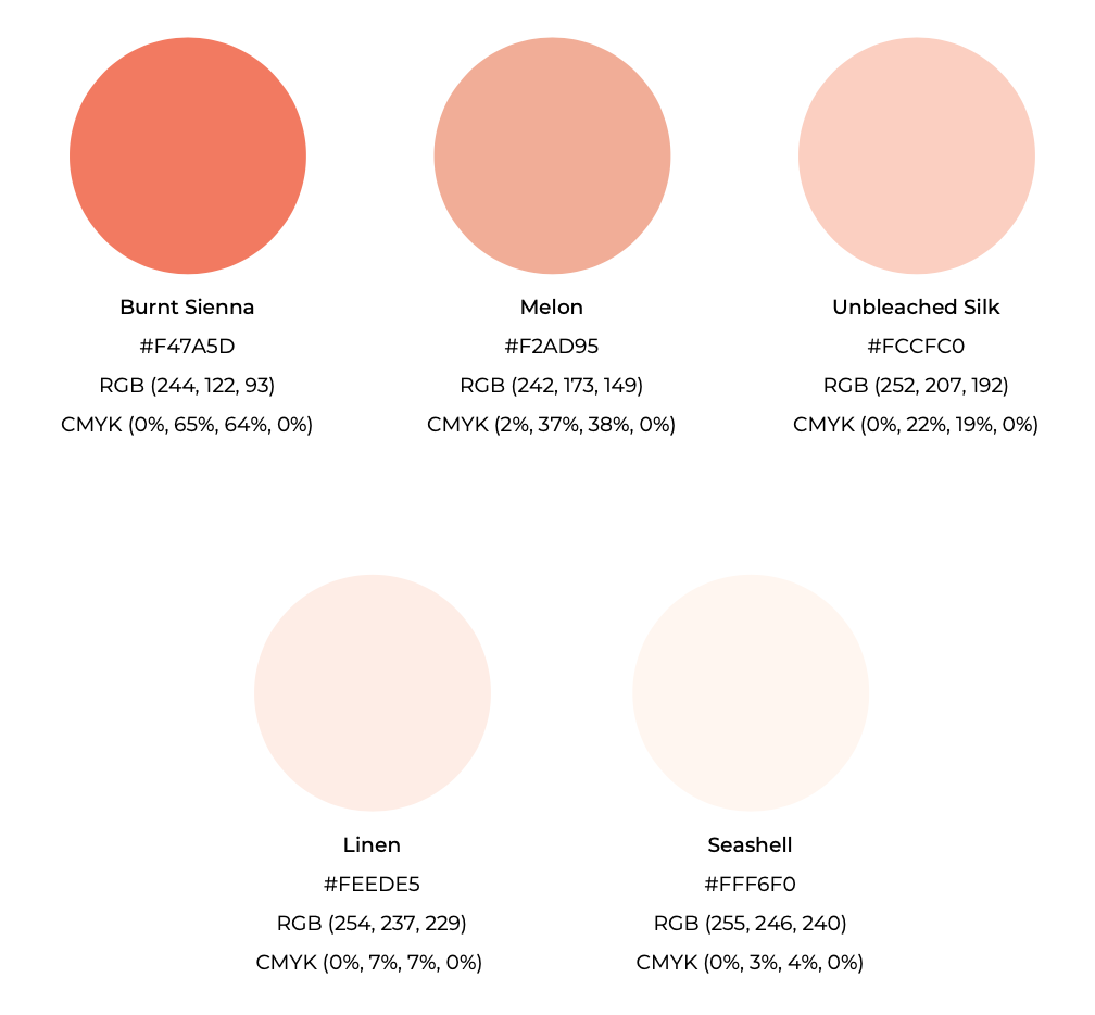
Brand Colour Palette
Now it’s time to jump back to our Brand Persona where we chose our Primary Brand Colour. Remember this colour was specifically chosen with your target audience and brand in mind.
What we need to do now is create a palette that compliments that primary brand colour. Your brand colour palette should be around 5 colours.
We can do this by following a simple formula.
2 Main Colours
1 Bold Colour – This should be your primary brand colour that aligns with your mission and brand persona. This is your attention-grabbing colour so you want it to pop!
1 Complimentary Colour – Select a colour that compliments your bold colour. You can use the colour wheel to assist you with this, however, keep in mind that there are many ways in which you can select colours within a colour wheel.
This website has a great infographic showing all the different Colour Harmonies and Schemes that you can use within the colour wheel.
3 Neutral Colours
1 Accent Colour – Select a neutral shade that pairs well with your bold and complimentary colour. This will help ground your colours and can be used as an accent or highlight colour.
1 Dark Colour – Now select a dark neutral colour that aligns with the rest of your colour scheme. This colour will be used sparingly but helps to add depth.
1 Light Neutral – Lastly choose a light neutral color. This colour will be used primarily for backgrounds or similar. It won’t take the limelight and is used again primarily to add depth to the brand palette.
Example of My Brand Colour Palette
A great free website you can use to experiment with different colour palette concepts is Coolors. It allows you to generate your own colour palettes using HEX codes so you can input your chosen colours to ensure they are cohesive and work well together.
Also if you get stuck for colour ideas, you can also explore trending colour palettes. I also love that it gives you names for each colour, for that added touch of personality.
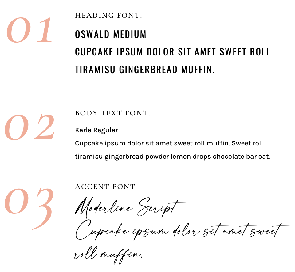
Brand Typography
We are almost at the finish line but we have one more task ahead of us. Selecting our brand fonts!
Keep in mind that we already made a head start here by selecting the type of fonts that best represent our brands during the Brand Persona section of the process.
With those in mind, we want to focus on selecting 2-3 main fonts for our brand. A Header font, A Body font and if it fits with your brand style, an accent font. I say if it fits because if your brand is more on the conservative, corporate side then an accent font probably won’t align with the overall visual persona you are trying to create.
A few things to note if you are new to the world of fonts and design, not all fonts are available everywhere ie. fonts that you find on Canva may not be available on your website platform of choice such as Showit, WordPress or Squarespace.
Although you can purchase and upload your fonts to all of these platforms, it can be a little tricky figuring out the right file types, you may need a bit of coding to make it happen. Also, there is the whole licensing types you need to be aware of.
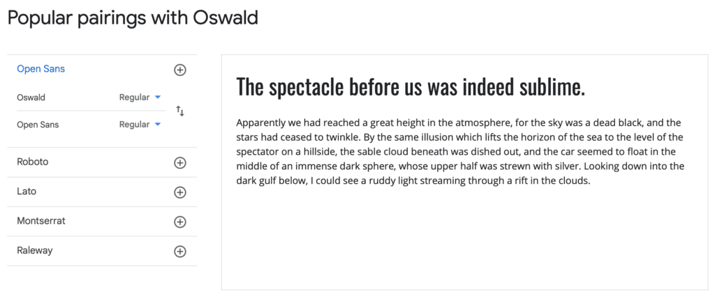
Google Fonts
My best advice is to stick to Google Fonts for your Brand Style Guide. The majority of these are available on most website platforms and they are also free to download and use.
Another great feature on the Google Fonts website is once you click on a particular font, you can scroll right to the button to a section called ‘Popular Pairing’ where it will actually give you font options that work well with that particular font.
Alternatively, you can jump onto Pinterest and search for font pairing. If your font style is San Serif you could search something like ‘San Serif Font Pairings’. Or if you’ve chosen a specific font such as Montserrat you could search ‘Montserrat Font Pairing’.
Accent fonts may be a little tricky as Google Fonts do not have a great variety of script fonts, so you could look at purchasing a custom font from Creative Market or there are a lot of designers out there who sell their own custom fonts on their website, just remember to check the licensing to ensure you are able to use it everywhere you’d like.
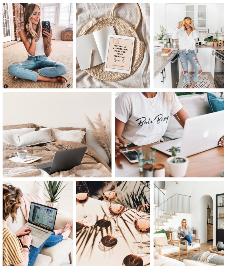
Brand Imagery / Elements
The icing on the cake with our Brand Style Guide is to create image and element guidelines for your brand.
This will be a moodboard that at a glance provides a really clear idea of what your brand should look like and what type of elements you’ll use throughout your branding.
You should be able to pull most of your imagery straight from your Pinterest Board you created earlier in the process.
Make sure your imagery tells a cohesive story.
- Will your images be bright and light, or will it be dark and moody?
- Will they be cooler or warmer-toned?
- Will you include photos of yourself or will your imagery be mostly made up of lifestyle shots or mockups?
- Will you use graphics such as infographics, memes, or quotes in your brand?
These are the types of questions your mood board should answer.
Not all brands will have elements within their branding. However, it’s easy to look past simple design choices such as the types of arrows you’d use for call-to-actions, the look of your website graphics or icons etc.
All of these make up a part of your brand. So again, take the time to ask yourself those trivial questions.
- Will your arrows be filled or outlined? Will they be thin or thick?
- Will your icons be outlined or 2D? Will they be a solid colour or full detail?
- Will your buttons be rectangular, rounded or pill-shaped?
- What icons could you include in your infographics that help identify and differentiate your brand?
Create Your Style Guide
We made it! We’ve done the hard yards, dug deep into our brand strategy, and built out an identity that truly aligns with your goals and mission. We know who we are helping and how.
We’ve followed that path right through to the cohesive colour palettes and outstanding font pairings, now it’s time to put it all together in a brand style guide.
I’ve actually created a complete Brand Style Guide template for you to download and fill in with all your brand details. It’s a Canva template so you can copy it straight into your own account and get right to the fun part of putting it all together.
You can get your hands on the template for FREE, just fill in your details below and you’ll receive an email with a PDF that gives you the template link along with instructions on how to add it to your own Canva account.
Creating an aligned and cohesive brand doesn’t need to be complicated or stressful, and I hope this mini-series helps you create the brand you’ve always wanted and puts you one step closer to achieving your blogging goals.
If you do use my posts and style guide template to create your brand, feel free to tag me on social media or send me an email because I would absolutely love to see it!
Disclaimer: I sometimes include affiliate links within my posts for my fave products. If you click and purchase, I may receive a small commission at no extra cost to you.


0
Comments