


Today I’m going to walk you through my starter blog design and give you an in-depth look at how I’ve set things up and why I chose to do certain things.
If you are a newbie blogger or someone who has been wanting to start a blog but always feels like you need to create so much content before you even launch your blog, then this is going to be really helpful.
I will however preface this post by saying that unless you have experience in designing websites (which I do), then I wouldn’t suggest starting from scratch on your blog design, especially not on a platform like Showit.
What I would recommend is opting for a template that gives you a base to work from, then using the advice in this post as well as my post on Creating A Blog With Minimal Content to tweak it to your liking, or blogging level.
My biggest challenge when creating my blog design was creating something that felt professional and lived in, even with the small amount of content I had to start with.
This can be a difficult task, especially when the only real examples and templates available are for seasoned bloggers with large content libraries, online shops, affiliate promotions and all the bits and bobs needed to really fill out a blog.
I built a completely custom blog that looks just as I wanted with that lived-in, professional look and I did it with just 3 static pages and 6 pieces of content.
The Blogging Platform
The platform I chose to build my blog is Showit. I’m absolutely obsessed with the Showit platform, the amount of customization you can do to your site is endless.
Coming from an all-in-one platform like Squarespace, which was my platform of choice as a web designer for many years, I was initially very sceptical about Showit simply because I liked the ease of Squarespace with everything like my email, domain & website hosting being under one account and dashboard. I didn’t like the idea of not having that streamlined system.
But after doing my research and looking into the transfer process I made the jump, and in all honesty, I was so annoyed at myself for not doing it sooner.
The process was so simple and the actual part that confused/concerned me was the actual link between Showit & WordPress, but the Showit Support Team actually set this entire thing up for you.
Alright, enough gushing – let’s dive into my blog design.
My Initial Process
The very first thing I did before I even started the process of designing my blog was get really clear on my brand strategy and I created a style guide to ensure I knew the right look and feel I was creating for my blog.
I actually wrote a couple of blog posts that walk you through the steps I took to do this, How To Create A Brand Strategy & How To Create A Brand Style Guide.
As I’ve mentioned, I used to freelance as a website designer so I have a good understanding of what makes up a good website design. I will say though that I’ve never created just a blog.
I originally did a lot of research and looked at a ridiculous number of blogs just to get a good idea of what kind of pages and elements make up the basis of a great blog.
I then took all my ideas and turned them into a rough outline, which most probably looks like a 5-year-old did it. I usually do this with just pen and paper, or in this case, I used Figma’s new FigJam feature which is basically a big whiteboard.
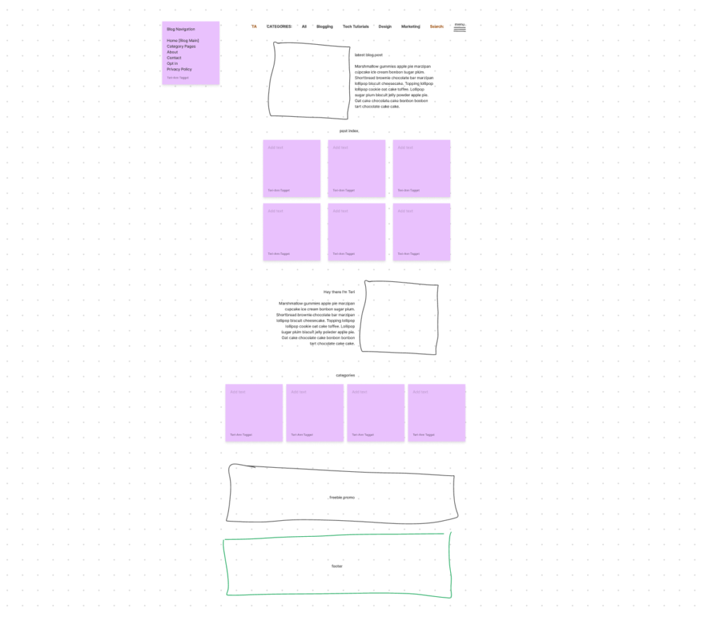
Like I said, it’s not pretty in any way and probably only really makes sense to me but I prefer to get a layout out of my head first without worrying about the details of the design.
After I was happy with the initial layout, I jumped into creating a more in-depth layout with some design elements included.
I do all of this initial design work using Figma which is a free prototype tool, it can do some pretty amazing things however I really just use it to create website layouts or wireframes.
That way I can play around with different styles and elements until I’m happy and ready to actually build it out on my website or blog.
Because I was designing for my own blog, I only did this with the main home page to get a good feel for how I wanted the overall site to look and what kind of key design elements and colours I was going to use.
For me, once I nail down the homepage, every other page is just a variation of the same design with a different layout.
My Blog Design
I wanted the overall look and feel of my blog to be light, bright and fun with plenty of colour, but I also wanted it to be clean and minimal.
There is nothing worse than arriving on a website with just too much going on, and too many options being thrown at you. So I wanted to ensure everything was easy to navigate and had a nice flow to it.
Before we dive into the tour and I share my thoughts behind each page, let’s touch on my navigation setup.
Across the top navigation bar, I’ve opted to have this be links to categories within my blog, as opposed to page links. I just felt like this made it feel more like a blog and would allow readers to quickly and easily navigate through different posts.
I’ve then included a small pop-up menu on the right which gives you links to the other parts of my website such as my About and Contact pages.
I prefer this layout because it puts the main focus on the content as opposed to anything else on my blog.
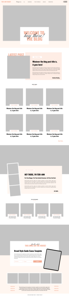
Home Page
Starting off on the homepage, you can see it’s almost identical to the wireframe I created. I think the only difference was the category description boxes.
They initially started out just as you see them in the wireframe, overlapping the bottom of the image, but after creating my blog sidebar I placed them in the centre of the image to keep the sidebar streamlined. I decided that I liked the look of that better so I went back & changed the ones on the homepage to match.
About Page
I’ve always had a love-hate relationship with the About page, mostly because it’s never an easy task writing about yourself, not for me anyway.
Within the layout, I chose to focus firstly on my story of how I got to where I am as a Blogger. Then I really just had a little fun more than anything and added a few different elements to increase that like-know-trust factor.
Blog Post Page
With my Blog Post Page, which is different from my main home page, I wanted this to be as clean and easy to navigate as possible.
So I opted to follow the same layout as what appears on my homepage which is 1 large ‘Latest Post’ section at the top followed by a grid-style post index with just the image and title appearing.
I opted not to include the post excerpts because I really just wanted a clean and minimal appearance, plus I know I personally don’t really read excerpts. A good post title is all you really need on display.
I also decided to create separate category pages with a custom title and image, this is in no way necessary but it does add another way for readers to easily filter your content.
I also decided to include them to make my blog feel more lived in, like there was more going on and to give readers more things to explore and click on.
Single Blog Post Page
Probably one of my favourite things about Showit is how you can fully customize your blog post page however you like using what’s called ‘WordPress properties’, basically placeholders. Then every time you publish a blog post through WordPress it automatically populates your custom blog post with the content. Amazing!
I spent a little time tweaking different things here, especially my font – the original font I had chosen, which was Karla Regular, appeared to be cluttered on the page. So I ended up changing it to Karla Light and increasing the font size slightly for better readability.
I’m also a little in love with my sidebar. Coming from Squarespace, which most of its templates didn’t have a sidebar included. The only way to do it was some makeshift workaround or by buying a plugin to add one, neither of which I could have been bothered with.
So now that I can create this completely custom sidebar is just a tad exciting for me! I’ve kept it simple though, because of the minimal amount of actual content across my blog I’ve just included a photo of me with a little bio, social links, an opt-in promo, and the categories of my blog.
Later I might add a ‘top posts’ section once I’ve got enough content and traffic coming to my blog.
Contact Page
My contact page is very simple with just a gallery slideshow, a contact form and a little blurb that lets people know when I’ll get back to them.
Later down the road I’ll probably add a FAQ section here and link up a media kit, but for now, this is all I need to get started.
My biggest challenge when creating my blog design was creating something that felt professional and lived in, even with the small amount of content I had to start with.
I’m really proud of what I was able to create with just 3 static pages and 6 pieces of content, and I hope this can serve as inspiration for anyone wanting to launch a blog but who feels like they need to have a full library of content and all the bells and whistles before they even launch.
Start small, focus on what you have, and build off of that.
Disclaimer: I sometimes include affiliate links within my posts for my fave products. If you click and purchase, I may receive a small commission at no extra cost to you.


0
Comments